Color Trends in Furniture: Insights for Modern Interiors
Furniture color trends are constantly evolving, reflecting shifts in lifestyle, technology, and design preferences. Today’s interiors are less about rigid themes and more about expressive, adaptable spaces that balance comfort with personality. From muted earthy tones to bold colorblock furniture, modern homes are embracing color in thoughtful and creative ways.
Start with soft earth tones - they bring calm without fading fast. A bedroom shifts when warm terracotta replaces cold gray on the walls. Think about how light moves through oak frames in the afternoon. Even one chair in deep moss green changes how a corner behaves. Spaces breathe differently once navy steps out and oatmeal flows in. Pick shades that age like old books, not last season's magazine. Mood lifts when colors work quietly instead of shouting. Function follows feeling when drawers and shelves wear gentle hues. Redesigns gain depth without drama by choosing wisely. Time passes easier in rooms dressed to stay.
Color now breathes life into spaces once ruled by neutrals. Though white, grey, and beige remain common starting points, richer tones weave through rooms more boldly than before. A chair might catch your eye first, then reveal its purpose. Pieces of furniture do double duty - holding things, holding attention.
Now color shapes spaces, draws attention to design details, yet builds feeling at the same time. Pieces like sofas, storage units, even side chairs bring fresh paint trends inside living areas instead of staying in corners.
Out here, choices bend more to what feels right than to fixed formulas. Home makers now blend surfaces, shades, or hardware styles - just because it works for them. A lived-in look grows naturally when materials meet without rigid planning. What sticks is what suits the person, not the trend.
Popular Colors in Furniture
Bold tones pop up more often in today’s living areas. Yet soft neutrals still hold their ground, quietly fitting into nearly any setting. A shift toward earthy hues brings warmth without trying too hard. Meanwhile, deeper shades add depth where light might otherwise feel flat. Some spaces lean into cool grays, though they avoid feeling cold by mixing in texture. Bright accents appear here and there, not everywhere - just enough to spark interest. Color isn’t just chosen for looks anymore; it responds to how rooms are used. Even small touches can change a space dramatically when placed right.
Earthy and Nature Inspired Tones
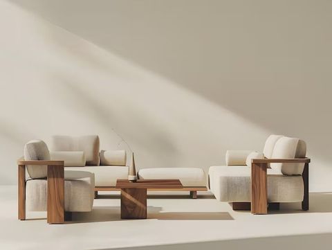
Brownish tones show up more often now because they feel steady and quiet. Coming from things found outside, these hues fit without effort into modern rooms just as much as older styles.
Common Tones Include
- Terracotta and clay
- Olive and moss green
- Warm browns and sand hues
- Muted rust and ochre
Wood, stone, or linen - each fits right into these tones without effort. Plants inside the home settle well here, bringing calm through quiet unity.
Soft Neutrals With Subtle Greens
These days, calm colors go way past just beige or gray. Lately, subtle tones have taken center stage - bringing quiet depth instead of emptiness. Hints of warmth matter more than ever in shaping spaces that breathe slowly.
A soft mix of gray and green gives evergreen fog its quiet depth. Though subtle, it feels alive under morning light or evening lamps. Living spaces gain calmness when painted this shade. Bedrooms become retreats without trying too hard. Kitchen cabinets in this hue balance warmth and coolness at once.
Warm ivory, greige, or soft pastels in muted shades remain popular choices. Because they work well with different materials, these hues let other colors stand out naturally.
Bold Contrasting Colorblock Furniture
Out of nowhere, bold-colored furniture pieces are catching eyes in today’s living spaces. Instead of blending in, these items clash on purpose - using opposite or matching tones across one sofa or chair - to draw attention without trying too hard.
Examples Include
- Sofas with dual-tone upholstery
- Cabinets featuring contrasting doors and frames
- Chairs with bold color combinations
Painting walls in bold, separate hues brings life into a room. When simplicity rules the decor, strong colors frame the scene instead. Furniture stands out more when surrounded by clear visual boundaries. Trying new combinations stays balanced through deliberate contrast.
Deep Jewel Tones
Deep, bold hues are returning with impact. Think emerald green, navy blue, burgundy - rich shades like these bring weight and elegance. Deep teal slips in too, pulling everything together through quiet intensity.
Deep hues show up a lot in bold furniture - think couches, loungers, or bed frames. With shiny details or warm light nearby, the mood turns rich but welcoming. A glow here, a gleam there - it pulls everything together without trying too hard.
Big rooms with lots of sunlight let jewel tones shine brightest. Their richness shows best when there is space to breathe. Light bounces off these colors, making them glow in a way small dark areas never allow. A corner bathed in morning rays turns deep emerald or sapphire into something alive. These hues thrive where shadows stay at bay.
Trending Painted Furniture Changes Room Looks
Some lately popular painted furniture gives you room to play with color, yet keeps things balanced. Because finishes made by paint open up choices, they still let one shape how a space feels.
Some Advantages of Painted Furniture Include
- Easy integration into existing décor
- Ability to refresh old pieces with new colors
- Frosted looks sit beside soft sheens. Some shine lightly, others barely reflect at all. Smooth textures meet subtle glimmers throughout. Each option carries its own quiet presence. Not too dull, never flashy - just balanced tones in between
- Opportunity to experiment with seasonal updates
Older furniture gets a fresh chance when paint changes how it appears. A coat of color transforms what might have been discarded into something renewed. Rather than tossing out what's already there, giving it another try makes sense. With just a few brushes and time, worn items find their way back to use.
Style meets function here, shaped by today’s design thinking. What stands out is how form follows real-world use. Not just looks - purpose drives the choices. Built to serve, yet never losing visual clarity. Decisions lean on balance, not trends. Clarity comes through in every detail, quietly doing its job.
Color Choices by Room
Built around distinct needs, every space balances practicality with feeling. Picking the right shades for furnishings lifts ease of use along with a sense of calm.
Living Room
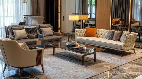
Furniture colors can take bold turns where people gather most. A living room lends itself to such shifts naturally.
- Neutral sofas paired with bold accent chairs create balance
- Colorblock furniture can define seating areas
- Earthy tones promote relaxation and warmth
Textures like rugs plus cushions build connections between separate hues. A room gains balance when soft layers link color choices unexpectedly. Different materials meeting on furniture create harmony without effort. Rugs drape one shade into another while cushions echo tones nearby. Each fabric adds depth where colors cross paths.
Bedroom
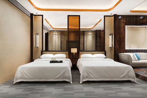
Bedrooms benefit from calming and restful color palettes.
- Mist-tinted cabinets breathe calm into corners. Pale sage wardrobes settle the air without effort. Green-tinged drawers mute noise before it forms. Stillness gathers near leaf-toned shelves
- Soft, quiet tones bring calm to a space
- Deep jewel tones can add elegance when used sparingly
Rest comes easier when furniture shades lean calm, yet still show who you are.
Dining Area
Some stronger picks work fine where people eat.
- Deep brown timber sits beside white-painted seating, creating a quiet clash of light and heavy. A chair here leans against grain that tells older stories. Surfaces meet without matching, yet balance appears anyway. Light catches edges where color stops and natural stain begins again
- Rich colors enhance the dining experience
- Subtle colorblocking can create visual interest without distraction
How light fills the room changes how shades look, meaning it must shape what pieces you pick.
Home Office
Quiet corners help thinking, yet open areas spark new ideas.
- Neutral desks paired with colorful storage units add energy
- Quiet colors help eyes feel less tired
- Strategic use of bold colors can boost productivity
A room feels different when the furniture shade matches how it's used. Mood shifts quietly under the right hue, guided by purpose more than taste.
Blending Several Color Trends
Out of nowhere, today’s rooms mix several shades instead of sticking to one set combination. Because of that, they feel more alive, built with depth.
To Successfully Combine Colors
- A beginning point sits quietly at the core. From there, balance finds its place without drawing attention. Structure grows around it, steady but unseen. The whole rests on that calm center, unshaken by what surrounds it
- Introduce one or two accent colors through furniture
- Use repetition to create consistency
- Balance bold pieces with subtle tones
Bold colors meet warm browns, creating spaces that feel both rich and grounded. A quiet beige sofa stands beside a bright blue wall, surprising the eye without shouting. Deep greens flow into sandy textures, letting contrast feel natural. Furniture blocks of red sit next to walls washed in oat milk tones - calm meets spark. Even stillness gains energy when pale grays frame a purple chair. Surfaces talk in layers, never matching, always working.
Comparison of Key Furniture Color Trends
Sunset hues like terracotta mix with deep greens and earth browns - commonly seen where comfort matters most - a feeling of being settled settles in. Pale blends such as greige flow into cream and gentle green, often found in quiet corners - spaces meant to slow thought down. Pieces built on two opposing colors stand out sharply when placed in shared zones - not loud but impossible to ignore. Deep emerald meets midnight blue and wine-red depth - these appear where nights stretch long and lights dim early. Old cabinets reborn through hand-picked dyes fit anywhere walls hold stories - each one changes without demanding attention.
Depending on what feeling you want a room to have, certain trends fit better than others. A calm atmosphere might call for soft colors instead of bold ones. Some styles work well in busy areas while quieter spots allow more freedom. Function shapes choices just as much as personal taste does. Each trend brings its own rhythm to the way a space behaves.
How Light Changes How Furniture Colors Look
Under sunlight, a sofa might seem brighter than it does at night. Lamps change how paint looks on chairs - sometimes softer, sometimes sharper.
Important Considerations Include
- Natural light enhances earthy and soft tones
- Warm lighting deepens jewel tones
- Lighting that feels fresh brings out bold color combos in today’s styles
Under bright light, a shade might look completely different than in dim settings - checking tones across environments keeps results steady. How a hue behaves where it will actually be seen matters just as much as the first impression.
Small Space Trend Adaptation
A tight space might feel closed off if colors are too heavy. Using pale shades along with smart contrast choices opens things up visually.
- Use soft neutrals for larger furniture pieces
- Add color through smaller accents
- Avoid excessive dark tones
- Incorporate reflective surfaces to enhance light
A splash of bold color on a chair or sofa works fine even in tight rooms - just pair it with quieter pieces nearby. Mix one vibrant item among neutral walls or flooring so the eye has room to rest.
Maintaining Timeless Appeal
Change comes fast, yet some rules stick around because they just work. Still, picking what lasts means seeing past the moment.
- Choose versatile base colors
- Incorporate trends through easily changeable elements
- Avoid overloading a space with too many bold tones
- Focus on balance and harmony
A space feels fresh when today’s touches meet older styles, mixing them so years pass without looking dated. Styles stick around because they balance what's new with what lasts. Old favorites sit well next to newer details, keeping rooms from feeling stuck in one moment. Lasting looks come not from avoiding change but by weaving it into something steady. Trends fade fast unless tied to deeper choices that hold ground.
Conclusion
Out of nowhere, soft browns and warm beiges bring quiet energy into living spaces. Instead of blending in, bold reds stand next to deep blues on sleek cabinets and low sofas. Sometimes it’s texture that leads, other times it’s hue taking charge across chairs and shelves. Rather than follow rules, people mix shades like stories - each piece speaking differently. Even neutral corners now hold surprises, lit up by an orange stool here or a moss-green cabinet there. Through shifts in mood and light, colors shape how rooms feel without saying a word.
Fog-colored wood pieces linger quietly, offering calm depth. Painted cabinets shift fast, bringing roomwide change without effort. These shifts connect - quiet tones ground a space, bold hues reawaken it slowly. One leads into another, mixing comfort with surprise. Seeing how they fit together helps shape rooms that stay fresh but never fade too soon.
Most of all, it's about staying even. Thoughtful mixing - of hues, surfaces, ways of arranging things - shapes rooms that work well while catching the eye. A steady hand makes all the difference.